New York Design Week is an annual city-wide gathering of brands, designers, engineers, craftspeople, and artists across industries. It’s a massive meeting of the minds that encompasses panel discussions and lectures, exhibits and trade shows, parties and workshops, held everywhere from independent galleries to the Javits Center. While it is a fertile ground for interdisciplinary discussion, however, Design Week is primarily catered to entities that design commercially viable products. JONALDDUDD, launched in 2015 by artists Lydia Cambron and Chris Held, sprouted from a desire to create space for a wider representation of independent creative perspectives within Design Week.
Each year JONALDDUDD operates out of different spaces and showcases a spectrum of work made by people both within and on the fringes of the industry. Their style is unique; rather than dividing exhibits into sections dedicated to an individual artist, Lydia and Chris layer pieces together to create a multifaceted display of fresh voices.
We spoke with Lydia about JONALDDUDD’s history and plans for their 2019 exhibit, which is open for submissions.
What are your and Chris’ backgrounds and how did you meet and begin collaborating?
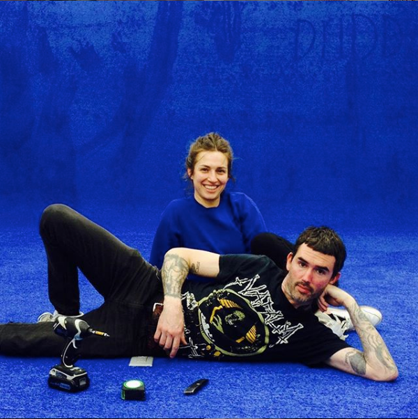
My background is in industrial design and Chris’ is in Fine Arts. He went to Oregon College of Art and Craft in Portland, where I’m from. I was living back in Portland after school, and we met through mutual friends and ended up sharing a studio space. Chris was working independently and I was doing contract work in retail design, but had a side practice and a studio. We shared it for a while and eventually collaborated on furniture. Then he moved to New York and we were working on a furniture project long distance, and I ended up visiting for work and then moved out here too.
My education is in design, but from a more conceptual approach and less of a product-driven point of view. There was overlap because Chris came from the other end of the spectrum, with a fine arts background that pulled from design elements. So it was interesting to work together and have a lot of similarities but from a different perspective.
How did designing furniture together turn into creating a Design Week exhibition?
We had gone to New York Design Week for several years, both as residents and visitors. It’s mostly about the industry and trends and resources, but we’d seen exhibitions that we considered more fringe and blending into the art territory, and found that really engaging and interesting. It was what we did in our personal practices and what our friends were doing. We wanted to see more of it, so we came up with the idea to facilitate it ourselves and create a platform where we could show that work.
So it was always intended to be part of Design Week versus having the idea and then realizing Design Week could be a home for it?
Exactly. Even the fringe exhibits that were already at Design Week were more about bringing products to market, rather than showcasing interesting work with less established exhibitors. That was something we felt like we could bring to the table: a platform that would show the depth and breadth of what we considered design and its crossover with art and craft, but also the spectrum of people working within it. Whether they’re fully established in an art practice and wouldn’t really show in a design atmosphere, or are from a design background but are less established, or just have maybe a one-off piece that they’re not trying to get picked up for production. Or even if they are, that’s fine. We’re just interested in showing the range and people who are using design as a way to explore and self express and are less tied to industry trends and marketability.
It’s a form of democratization, right? Very cool that you’re able to bring in a diverse set of voices and open it up to people who maybe otherwise wouldn’t have an opportunity or wouldn’t think to showcase their work in that context.
Yeah! People who would be like ‘I’m not a designer, I’ve never fit in there.’ We are saying ‘no, we’re putting all this work together to show that there’s a common thread.’ Even if it’s people in separate fields who draw from the same form language. It’s interesting to place it all together and blur the boundaries.
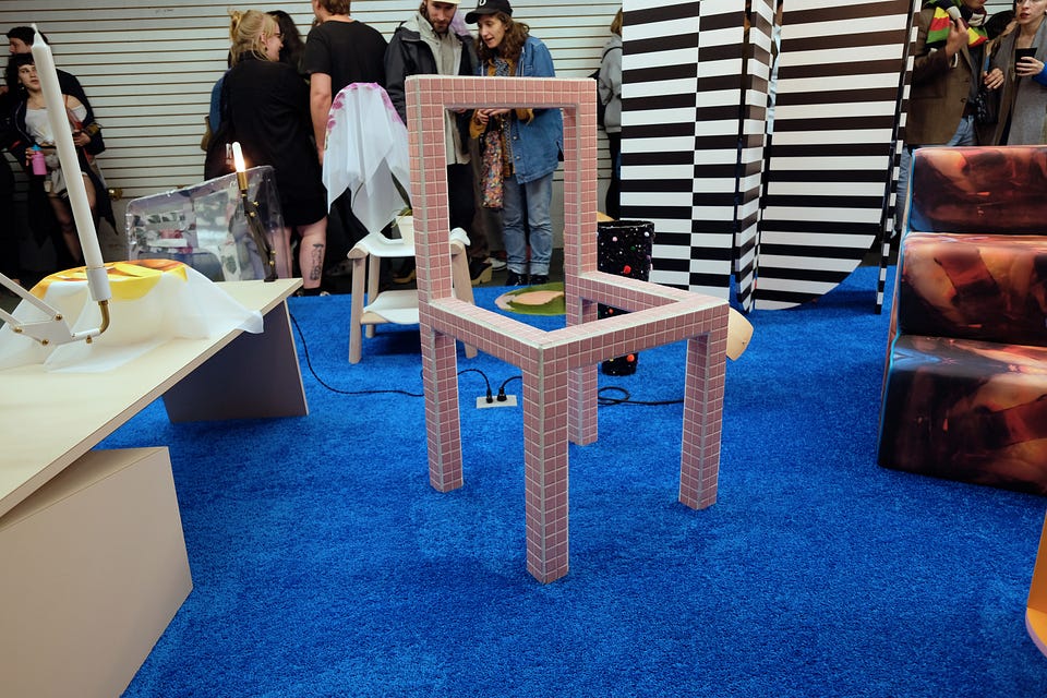
We want to show that there’s continuity within the work regardless of the background of the creator or how established they are or what their directive is — someone could be exploring a material or they could be trying to communicate a clear thought. Layering the work and stripping out the artist information gives it a democratic platform. We still put info on the website and have an artist statement book and list of pieces and names, we just don’t show it within the exhibition and separate the pieces out. If there’s a table and a vase from separate people, we’ll put the vase on the table.
Do the artists give you control over how you display their work or do you work in tandem with them?
The artists have usually seen our past exhibitions and know what it looks like. I think the people who apply are excited about that. We judge each submission individually and think about the person’s practice: do we feel like they are using design as a tool and working in their own directive and not just following a trend? We also make sure we have a range so that we can pool it all together as a collective of work.
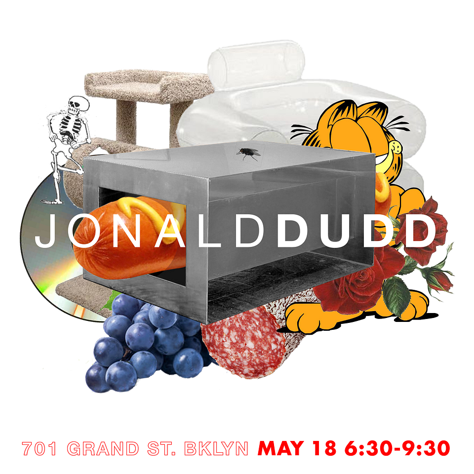
Can you talk about JONALDDUDD as a brand with a personality? It has a clear look and feel, and the name clearly references the late artist **Donald Judd. How does it draw from who you and Chris are?**
When we were talking about what the show was going to be and what it was going to represent, we were discussing other artists who have done this kind of work in the past. We realized Donald Judd was both in design and outside of it. Then we accidentally said his name wrong, and it felt like the perfect blend of design and comedy. It’s the name of someone whose work we admire and who was in that crossover territory, and the switch of the letters adds the element of snarky comedy. Our identity comes from the humor of being different within this industry and playing that up. But it is still something we take very seriously.
That totally comes through in the visuals and the voice. It’s very distinct and not what I’d necessarily expect.
We wanted to make it fun, for us as the people putting it on and for the people exhibiting. In our own personal work, we have both brought in comedy a lot. Within JONALDDUDD Chris and I might have different art, design or cultural cues that we pull from but our overlap is the sense of humor. We like the idea of JONALDDUDD as a brand with an evolving aesthetic. The sense of humor is the constant, but we change the logo and theme every year.
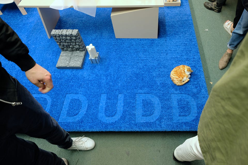
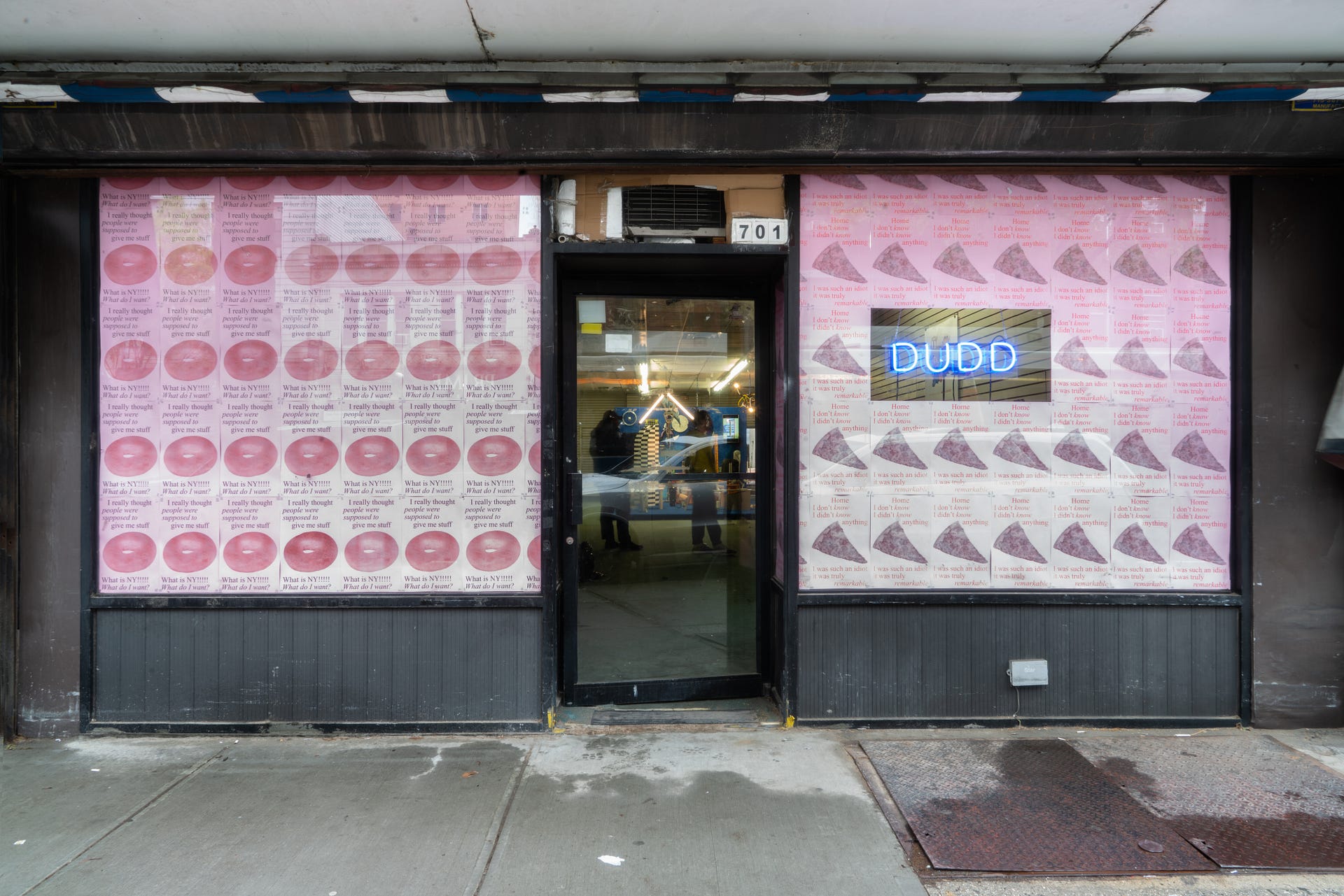
Last year the name of the show was “Return of the Living Dudd”—we’d done a show before Design Week in 2017 and had opted out of Design Week, so it was a way of saying we were back. We used that as a guide for the promo material. The physical exhibition plays off of the theme too, but it’s not strictly tied to it. It’s a pop up event, so we have to respond to the space we have in a way that makes sense. The first year it was a narrow space, so instead of a platform we put pegboard on the wall and strapped everything to it. The second year we had an artist studio and we built a faux brick platform and backdrop across one side of the room. And last year, we had an old 99 cent store, and we put a platform down the center and did a carpet sweep up to the back. The carpet sweep didn’t have a connection to theme, but it was drawn from our collective catalog of aesthetic interests and humor. The idea of having bright blue carpet as your backdrop and platform for an exhibition, there’s some comedy in that.
On the topic of blurring boundaries, do you ever get pushback from people in the industry about showcasing functional objects as art in the context of this largely commercial event?
I haven’t heard anything. People are just interested and find it refreshing to see. We’re not saying what we’re doing is better, it’s just different. It’s another aspect of the existing design conversation.
How has JONALDDUDD evolved over the years?
After the first year, we started to identify the characteristics of the show, what it meant to be a part of Design Week, what kinds of people and work we were looking for. This is the fifth year, so we’ve got a lot to look back on and can find areas to expand.
Last year we had a larger space, and we reached out to artists and designers to do separate projects within the exhibition. We had an artist build a bar for the space and create a whole experience around it. We also had a backyard area where a design duo did a furniture series specifically for the event. It was an opportunity for both to explore materials and forms they were interested in but were a little outside of their practices. So JONALDDUDD is becoming a platform for satellite exhibitions, artist features and experiences.
Do you envision doing anything outside of the timeframe or geography of NY
Design Week?
We always want to continue to offer that platform, but we have talked to past participants about collaborating in different places. The scale and format can shift but we’d never want to get away from the tone and how we respond to spaces, and we’d never want to get to a point where we no longer provide the same opportunity for people who are not already part of Design Week or the industry.
I want to talk about your partnership with Chris. How have you two been able to work together in such a harmonious way over several years? How do you not drive each other crazy — any secrets?
I don’t know how harmonious it is, ha! It has its ups and downs like any collaboration but we have a strong mutual respect for the work we’ve each done as individuals. There’s a sense of trust and appreciation for what the other person is thinking and is capable of doing. With JONALDDUDD we can both have different personal interests and aesthetics and themes that we’re drawn to, but the overlap is the sensibility and the sense of humor.
So it’s like this fundamental understanding that you have always had.
Yeah. It probably helped to share a studio space for a while without working together. We’d talk about our projects and over time we realized we have a lot of shared interests and perspectives. Then we did a couple furniture projects together that were successful, so that helped build trust. We come from different backgrounds and have different ways of generating ideas and communicating, but we’ve always managed to stay on the same page.
Is there anything people should know about this year’s call for submissions before going in? How many people do you usually accept and what are you hoping to see in the submissions?
The best bet is to look at the work on our website, get a sense of our tone and understand the range. We are open to anyone who uses design to explore ideas. We have had small shows where we’ve shown the work of 10 people, but last year we had 35. It goes in tandem — looking at the work, finding a space, figuring out what we can do. This year we decided no wall work, so that narrows it down. We’re still doing ceiling hung or projections. Just no physical wall.
What prompted you to make that decision?
We want to try something new, and curatorial wise, it frees us up. We just want to see if not doing a wall offers some other avenue of platform that we hadn’t considered before.
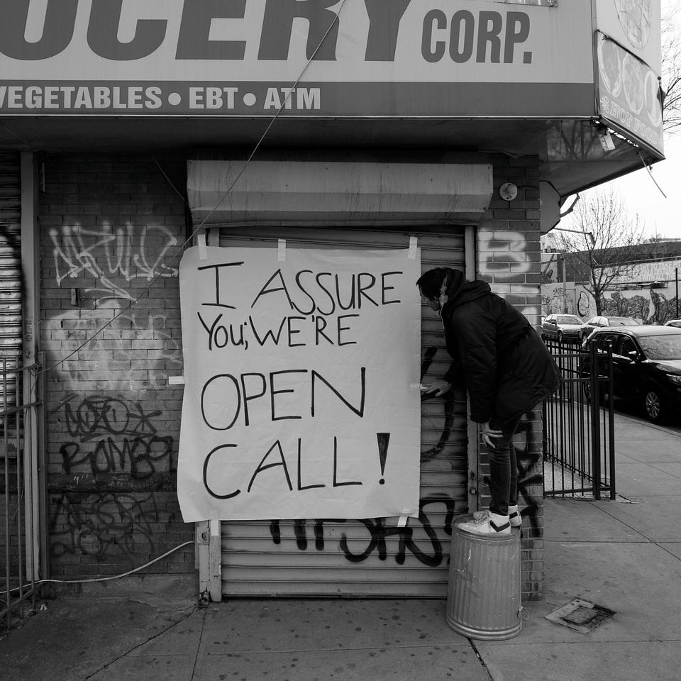
Head over to JONALDDUDD’s website to learn more and submit your work for the exhibit. Questions or comments? Let us know on Instagram
All installation images by Jason Mandella. 2018 opening night images by Aaron Willam Jacobson.