Throughout his ten years in NYC, architect, graphic designer, and children’s author extraordinaire Rajiv Fernandez has acquired a treasure trove of knowledge about all things apartment hunting, living, and design. Drawing inspiration from his background and upbringing, Fernandez launched his own design company, Lil’ Icon, earlier this year. His design work and writing are packed with humor, cultural references, and iconographic imagery stemming from his unique lens: he is ethnically Indian, born and bred in Iowa and Nebraska with a Hispanic last name, and has lived in places like Buenos Aires, Bangalore, and now Brooklyn. And if all of that doesn’t sound like enough, he also does improv.
What got you started in design and how did your career lead you to New York?
Hanging out at my mother’s restaurant as a kid, I would draw houses and neighborhoods on the place mats. I would tear off the perforated edges of computer paper and tape them together to make city plans inspired by the metropolises I visited. It was evident at the age of seven I would be an architect. I had mentors who guided me and encouraged me to pursue it. When it came time to choose a college major I was at the height of my teenage angst and chose civil engineering to spite everyone. I hated it and realized I did want to be an architect. A trip to the Taj Mahal confirmed my destiny, seeing how built design could have an emotional impact (a scene straight out of The Namesake).
I did my masters in architecture at Columbia, which brought me to New York. I sought the experience to be in one of those great metropolises I drew as a kid. *I appreciate the values of growing up in a small town, but the fast pace and progressive thinking of New York keep me moving. *Columbia set me up with a great professional network and my first job was with SHoP Architects working on the Barclays Center. I worked for a boutique developer afterwards and did graphic design on the side. My graphic work allowed me to produce content that was reflective of me. After creating a bespoke book comparing my nephew and myself, I developed Baby to Big and Baby to Brooklyn, which led to me creating Lil’ Icon.
What are some challenges of working as an architect and designer in NYC?
Designing in New York teaches you about efficiency. You don’t have the luxury of open space like I grew up with as a kid. A lot of my ideas for what people needed in their home were dispelled (like a breakfast room, garden room, a giant shelf for shot glasses collected from every place I visited). The spaces should be multifunctional. In my place my kitchen is also my office, entertaining area, and selfie background. Since New York is a place where people are constantly moving, you also have to design for the future, whether it be resale value or adaptability of space.
What NYC neighborhoods have you lived in, and why Brooklyn now?
In 10 years in New York I’ve lived in Morningside Heights, then South Williamsburg, Prospect Heights, and finally in Brooklyn Heights for the last three years. I moved to Brooklyn because all my friends did after we finished grad school. I had only been there twice before I moved. I assumed everyone’s dream was to live on CPW which elicited side-eyes. Now, I’m the one saying I don’t leave Brooklyn on the weekends.
I looked for studios or 1-bedrooms in my price range for about a year. I was actually looking in Prospect Heights and Clinton Hill, but the inventory wasn’t there. Brooklyn Heights had studios that were in my range, so I felt comfortable about investing in this area. It’s hands down one of the most beautiful neighborhoods in the city and there’s so much history here. Its access to multiple subway lines and Citibike docks allows me to be super mobile.
My apartment is in the landmarked St. George Tower. It had most things I was looking for — elevator, doorman, near to subway. The killer views from the shared roof was the cherry on top! When I saw the unit I bought, I knew it was for me. It had tons of natural light and ample storage. It was a bit of a fixer upper, but as an architect I was excited about what I could do with the place.

So what’d you do with it?
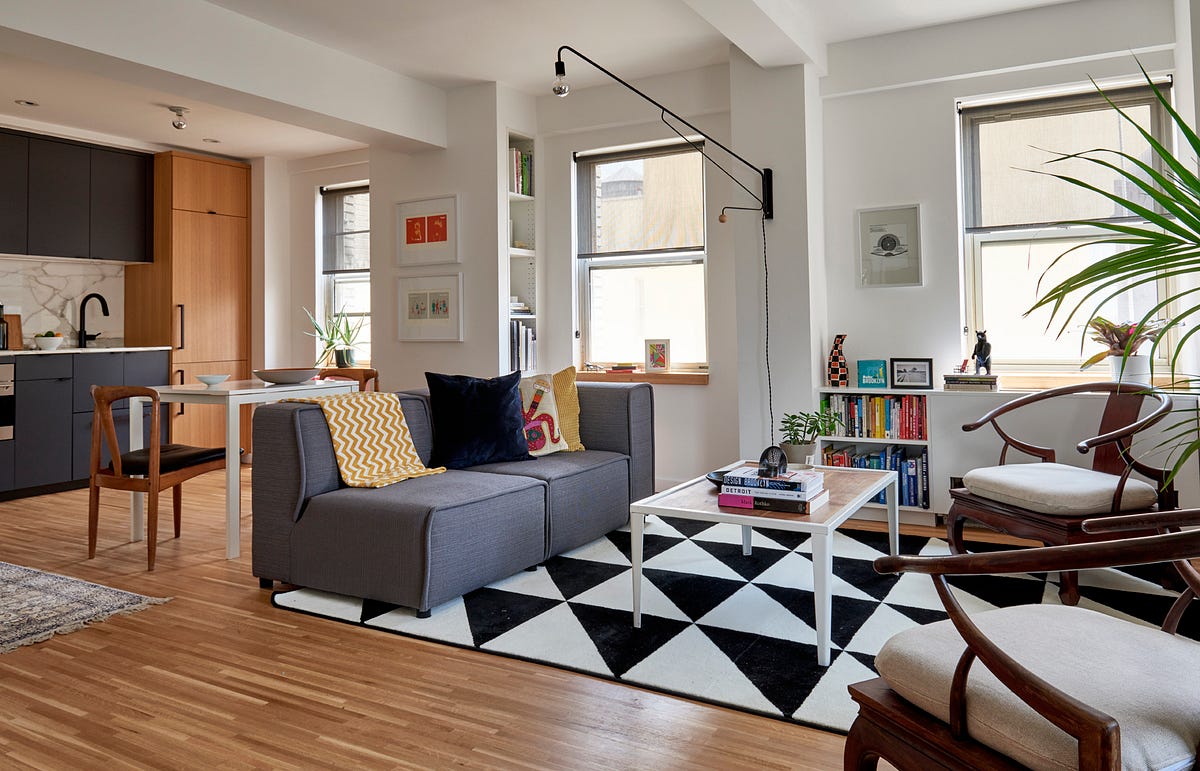
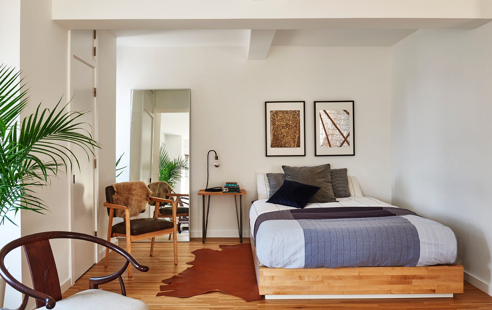
I love gallery spaces so I stuck with simple white walls and wood floors. My favorite buildings in the city are museums like the Guggenheim and MoMA. I like a really monotone palette. When I use color in my architectural work, I want it to be from a natural materials like wood or stone. My artwork is filled with color, so that is what adds character.
The unit measures 540 sf and is L-shaped, which offered a natural sleeping alcove. I took down the wall between the kitchen and living area which added natural light to the entire space and makes it feel large for a studio. In my bathroom I used white pennyround tiles, inspired by Saarinen’s TWA terminal.
What are your favorite furniture pieces in the apartment?
All my chairs! Two sitting chairs that I recushioned were originally from Hong Kong and passed down from my grandparents. Everyone in my family hated them except me, so I got them. They’re comfortable and have an open back so they look really lightweight. My dining chairs were actually from our breakfast room growing up. Luckily my parents had good taste and the foresight for mid-century modern to come back into fashion. I also have a chair that I found on the street, sanded down and reupholstered. The chairs are all reflective of different periods in my life: heritage, childhood, and hustling.
Any tips or shortcuts you can share for others looking to maximize small spaces affordably?

Use every nook and cranny you can find. I turned an unused nook into a linen closet without losing floor area, a dressing area into a walk-in closet, and a extra closet adjacent to the kitchen as a pantry and bar. This gave me more counter space to what was limited in the kitchen. Hack IKEA pieces to save on doing custom mill work. Also, I used leftover floorboards to make matching window sills.
If you’re going to spend money on one thing make sure it is what you use most. For me that was the kitchen. As a kid I was fascinated by fridges that looked like cabinets. By integrating the appliances into the millwork it’s a sophisticated solution to having your kitchen in your living room. The fridge/freezer has integrated millwork panels as does the dishwasher drawer beneath the sink. All other cabinets are for storage. The electric speed oven also duals as a microwave, which is more commonly found in Europe. This was a huge space saver.
What is your advice for current or future NYC apartment-hunters?
Spend time in each neighborhood. Make sure it works for you on a daily basis whether it fits your commute to work or your nightlife spots. When you’re in your 20s you’re out and about exploring all the city has to offer. In your 30s you make your home a comfortable place to be (and binge watch Netflix). And if you’re able to renovate your space, make sure to live in it for a while. I would have put up a partition where my sleeping alcove is, but I’m glad I didn’t. You want to make sure to design for the 50 weeks of the year you live in the space, not the two when you have guests.
What inspired you to turn Baby to Brooklyn and Baby to Big from ideas into reality?
I made a keepsake book for my nephew that compared him and me. It was inspired by Paris versus New York by Vahram Muratyan. I injected humor and culture into it. When he was two he was reading the whole book on his own recognizing the images and the words. People saw it and told me I should publish it, so that’s when I started working on Baby to Big. I was laughing about how Brooklyn has so many idiosyncrasies about it so Baby to Brooklyn became my love letter to my adopted home. It’s really rewarding seeing you taught someone new words, like booty, man bun, and best friends, but moreso making a child laugh.
What’s coming up for you in 2018 and beyond?
A lot of people are asking for a book for their own city, so I’m working on that. Also, I have an ABC and a tongue-in-cheek book that I’m developing. The inside jokes are definitely for the millennial crowd, but the content is safe for the kids!
I’m also looking to make a bigger impact with Lil’ Icon. I like doing positive messaging through my artwork.** There were many reasons to be vocal and active in my community, and for me my artwork was the way to make my voice its loudest. **I was a finalist for the new “I Voted” sticker in NYC, which featured a diverse cast of New Yorkers and the Statue of Liberty. A protest poster I did will be in a book from Princeton Architectural Press in early 2018. In my children’s books I try to dispel stereotypes by including a lot of diversity. That and making people laugh.